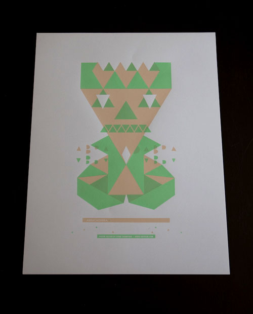
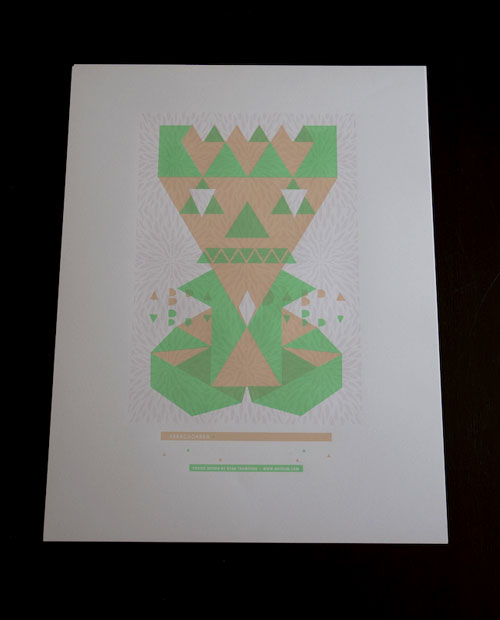
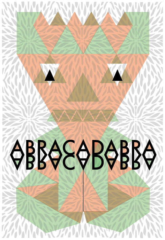
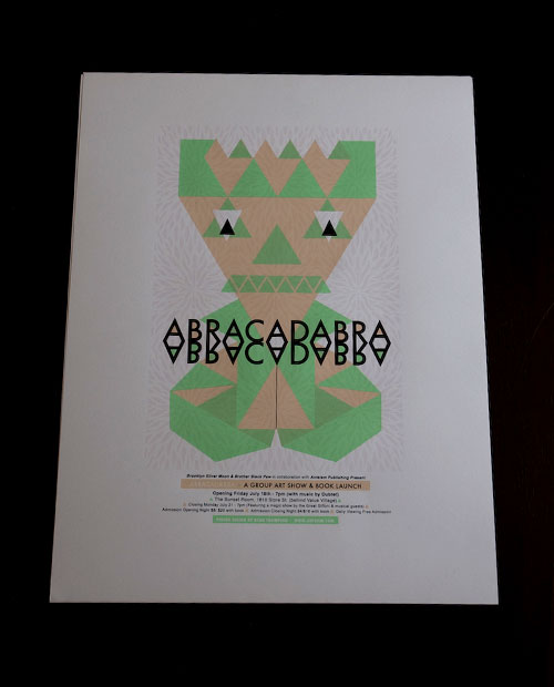
I had the opportunity to design and screenprint the Abracadabra art show and book launch poster. Here are some  photos from the screen-printing process. The poster is a 4 colour design, the third colour being a faint gloss spot colour. The poster was screen-printed at the Seriscope Studio. First I started out with a quick sketch which was then realized in Adobe Illustrator. Illustrator is great for creating geometric shapes, it's quick and easy to resize images and makes for a good program to mess around with. Photoshop can be a little more static because your actually painting pixels, which can be hard to make changes. The colours of the design on screen are only a guideline when choosing colours for printing. The final decisions happen when mixing inks right before the print. Here is the final design.
When screenprinting you must separate each colour, which is then "burned" to separate screens. These screens are used one at a time to lay down individual colours. You will notice an olive green colour that was created by overlapping the light green and peachy/tan colour.  I'm not gonna go to much into screenprinting because all the info is out there on the internet. Here are the four stages of the poster printing.
1. First Colour - Peachy / Tan

2. Second Colour - Bright Green

3. Third Colour - Transparent Cotton Candy Pink Gloss

The Abracadabra posters will be available to purchase in the coming days through our online shop.  The edition is signed & numbered / limited to 30. Pre-orders are being accepted via email.


